Famous quote from Mark Twain “I apologize for such a long letter – I did not have time to write a short one.” – can be easily paraphrased for dashboard design purposes: “Sorry for the multi-page dashboard – I didn’t have time to create a single-screen one.”
In this short article, we will answer the question of why we need single-screen dashboards and how to fit everything we need into one page.
Why save space?
Let’s make it clear first, why all this fuss with saving space in dashboards? Why can’t we just take as many pages as needed to create a complete, comprehensive report?
Stephen Few, a data visualization and dashboard design guru, suggests that “something powerful happens when we see things together, all within eye span”. I’m pretty sure this “something powerful”, “miraculous” is a story forming in our heads.
Thing is we can only hold several chunks of numerical information in our heads: one chart, one number in a table, a highlighted data point… if we turn a page or scroll down, we cannot reliably recall al the information from the previous page. But if the story forms in our heads before we switch to another screen, we remember the whole story. That’s how our hunter-gatherer brains work.
If we want to effectively interpret data insights and act upon them, we should enable a story form in our heads based on one page of information, that is why we fit all the necessary pieces of the data story into one screen.
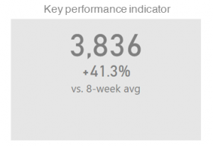
Card

This is a great and compact way to display a single KPI. It takes up much less space than a two-column (two-bar) chart, allows KPIs to be compared against the relevant benchmark, and enables conditional formatting as needed. Charts are great, but not every piece of information needs a chart.
Sparkline

A sparkline is a small line chart, typically drawn without axes or coordinates. It presents a general shape of the KPI over time in a simple and highly condensed way. Very often we only need top-level information about our KPI (stable, plummeting, rocketing, way above average…) all the additional details just slow down our perception. When used in dashboards, sparklines always tell the story at a glance.
Bullet graph

Normally, when you are comparing your KPI against two different benchmarks at the same time (e.g. Actual vs. Target and Last Year) you need three columns or bars. This is a complete waste of space. Bullet graph is space efficient, and, to my taste, makes comparison even easier.
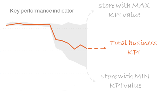
Band chart

The Band chart (or range chart or high-low line chart or corridor chart) is my personal favorite and totally undervalued type of chart, not only in practice but in dashboard design “textbooks”.
For our one-screen dashboards it’s value is beyond price.
Basically, a band chart is a standard line chart enhanced with a shaded area displaying the upper and lower boundaries of groups of data (e.g. the range between the minimum and the maximum of all category members, in my case stores).
The shaded area allows me to ditch breakdown of the KPI by stores, as it is practically built into my timeline. At one glance I can see whether my problem affects all the stores, or one particular store pulls down the entire business average.
Band charts provide by far more context to your visualization and more insight into your data.
What’s next?
Creating space efficient dashboards takes practice. At first it will take twice as long, as building a regular one. Very soon though, you will start thinking in cards, sparklines, bullet and band charts. Sometimes there simply isn’t a better way to visualize something, even if you don’t have space constraints.
For dashboard design practice check out my Storytelling with Dashboards Workshop.
