or why you should avoid any charts with food in the name
17. 11. 2019
olga
9666 Views
pie chart
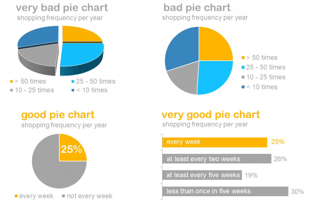
Usually at my “Storytelling with Business Data” workshops audience splits into pie-chart-lovers (hopefully minority) and pie-chart-haters (hopefully majority). But it is hard to find a single person in the audience, who has never created a pie chart.
Pie chart is probably one of the most overused charts in data visualization history.
And they indeed have one strong side – they clearly show that parts form the whole, i.e. add up to 100%
But we pay quite high price for that.
Pie charts are difficult to read. Our eye works in a way, that it is hard for us to compare size of different segments, it requires comparing angle width and arc length.
In the best case we can tell which segment is bigger (not always the case), but we struggle with telling by how much.
It is easier for us to compare just one simple parameter, like length of a line… or a bar.
That is why many experts recommend replacing pie chart with a bar chart.
See for yourself:
It effectively means:
Use pie chart in very rare cases, when there are just two segments of clearly different size!
Never make it 3D!
And always consider bar chart instead.
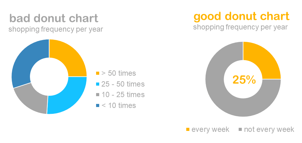
donut chart
The only chart, which is even worse than pie chart is donut chart. It is actually nothing else than a pie chart with a hole in the middle.
Problems with is the same – our eye is forced to compare arc length instead of a bar length.
Main rule for using is: don’t!
Other rules for using it:
Use donut charts in very rare cases, when there are just two segments of clearly different size!
Place highlighted segment label in the middle of the chart
And always consider bar chart instead.
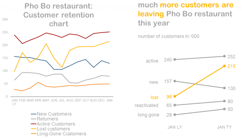
noodle chart
Noodle chart is a line chart where lines overlap a lot making it difficult to read.
Helping our audience focus on one series at a time can solve this. My favorite solution is a slopegraph (which is nothing else than a two-point line graph with markers). A slopegraph shows the change between only two points, absolutely ignoring points in between. It uses our human ability of quickly noticing changes in direction: increase or decrease.
 17. 11. 2019
 olga
olga 9666 Views