

Need to compare performance across categories while also comparing it against last year and budget?
Then a regular bar chart is often not enough.
A simple bar chart can show the current result by category. A grouped bar chart can compare two periods. But once you add a target, the chart usually starts to get crowded.
That is where a horizontal bullet graph fits.
A horizontal bullet graph lets you compare three things in one clean view:
- current performance
- previous or comparative period
- target value
This makes it especially useful for business reporting, a classic use case is actuals vs. LY vs. budget. Think sales by product line, performance by team, results by region, KPIs by department, pricing by category, or any situation where you need to see not only “what happened,” but also “how it compares” and “whether we are on track.”
The example here compares average price per unit across several product categories. The light bar shows the 2021 value. The darker bar shows the 2026 value. The black marker shows the target.
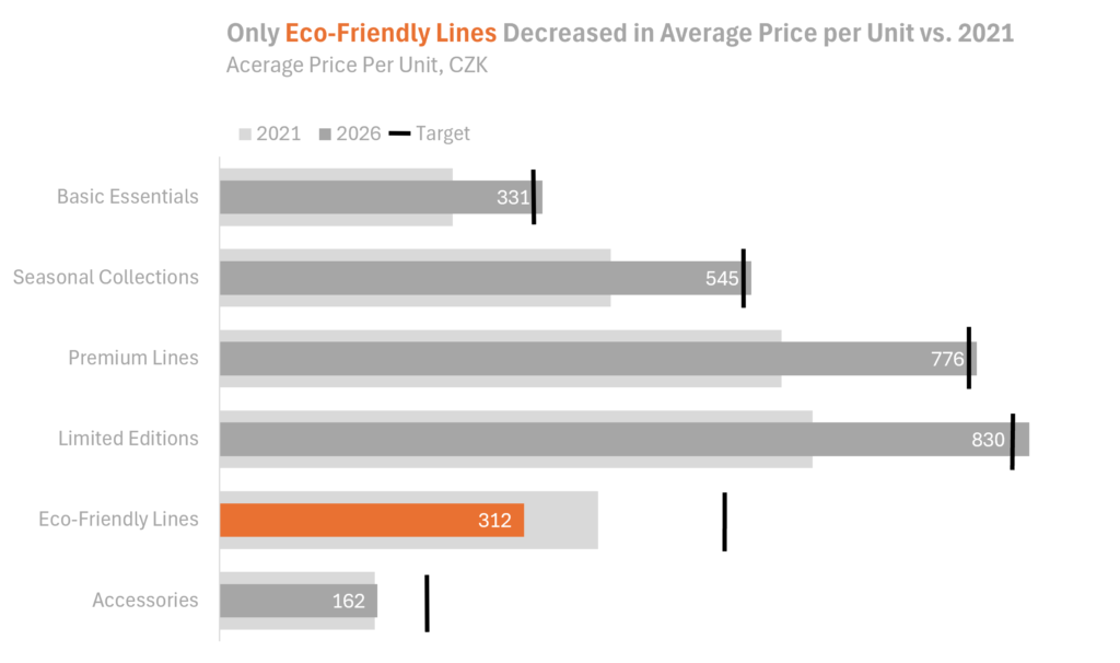
The message becomes visible very quickly: most categories increased versus 2021, while Eco-Friendly Lines decreased. That one category immediately stands out because the color changes. The chart does not need much explanation. The design does the work.
The challenge is that horizontal bullet graphs are not especially easy to build in Excel.
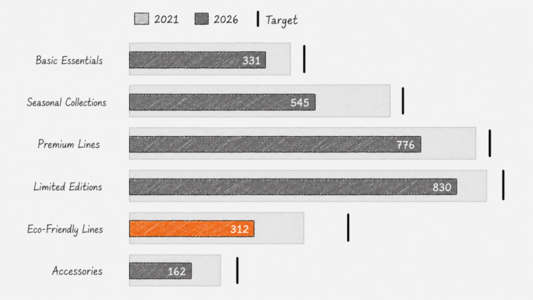
You can create a simplified version with a current period and a comparative period. That already gives you a useful chart. But once you add targets, it becomes much more manual.
You are no longer just creating a chart in Excel. You are practically drawing one.
This is where AI can help.
With AI, one well-written prompt can turn the same data into a full, clean, interactive chart.
That is a very different way of working.
The hard part shifts from “How do I force Excel to build this?” to “How do I clearly describe the chart I need?”
And for many uncommon charts, that is a much better problem to have.
This does not mean Excel is no longer useful. Excel is still excellent for preparing data and building many standard business charts. But for more cusom visuals, especially charts that need precise layering or non-standard design, AI can often get you to a polished result much faster.
The practical takeaway is simple:
Use Excel when the chart type fits naturally.
Use AI when the chart is conceptually simple but technically awkward to build.
A horizontal bullet graph is a perfect example.
Video links:
What can be created in Excel — current and comparative period only: here
How to create a full horizontal bullet graph with AI: here