

Comet charts are one of the most intuitive ways to compare two moments in time.
The problem was never the idea.
It was the tools.
Some charts are useful because they are precise. Others are useful because they are intuitive.
A comet chart is both.
The idea is simple: you compare two points in time by showing a “tail” for where something started and a “head” for where it ended. The direction tells you what changed. The length tells you how much. And the shape makes the movement feel obvious.
You do not have to explain much.
People can see which comets are flying forward, which are falling back, and easily spot the ones that behave differently from the rest.
That is exactly why I have always liked this chart type.
I first fell in love with comet charts during a Steve Wexler workshop. They felt elegant, compact, and easy to read. They solved a very common business problem:
What changed between then and now?
And then I basically never used one.
Not because the chart was not useful.
Because I could not easily create it.
That is the strange thing about data visualization. Some of the best chart ideas never make it into everyday business reporting because they are not available as a default option in Excel, Power BI, or whatever tool the team happens to use.
So we end up using the charts that are easy to make, not always the charts that are easiest to understand.
For comparing two moments in time, we already have plenty of options: slope chart, bullet graph, arrow chart, clustered or overlapping bars…
None of these are wrong.
But comet charts have something special: they make change feel physical.
The tail gives you the past.
The head gives you the present.
The direction gives you the story.
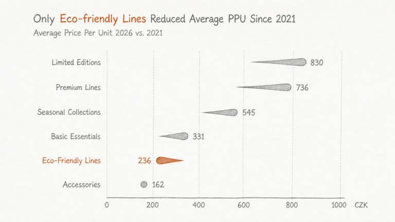
In the example above, the chart compares average price per unit between 2021 and 2026 across several product lines.
What stands out is not just the individual values. It is the pattern.
Most product lines are moving in one direction. The eco-friendly line is moving the other way. That makes it immediately visible as the exception.
You do not need to scan a table or compare pairs of bars. Your eye catches the one “comet” flying against the rest.
That is the value of the chart: we see anomalies, outliers, not just numbers.
This is especially useful in business contexts where the question is less “what is the exact value?” and more: What changed, and where should we look next?
A comet chart can work well for pricing changes across product lines, margin movement by category, customer growth by segment, market share shifts across regions, sales productivity before and after a program, inventory days across business units, cost changes across suppliers, NPS movement across customer cohorts, or sustainability metrics over time.
The common thread is simple: two comparable points, multiple categories, and a need to spot direction and magnitude quickly.
That is where comet charts shine.
They are not ideal for every situation. If the audience needs to compare many intermediate time periods, use a line chart. If the exact variance is the main point, add labels or use a variance chart. If there are too many categories, the chart can get messy.
But when the task is to compare “then versus now,” and especially when you want to highlight the items moving differently from the pack, comet charts are hard to beat.
And now the practical barrier is much lower.
Instead of waiting for the perfect native visual or manually hacking shapes together, I can ask AI to build one.
The workflow is surprisingly simple:
Open a canvas.
Use D3.js.
Render an interactive, minimal comet chart on a white background.
Use the data from the CSV.
Then refine it like you would with a designer. If needed.
Watch the video to see for yourself.
For business users, that is a big shift.
Because most reporting teams are full of smart people with good visualization instincts, but they are constrained by default chart menus. AI gives them a way to prototype custom visuals without becoming full-time developers.
That does not mean every report should become a gallery of exotic charts. We do not aim for variety for variety’s sake.
The goal is fit.
And for comparing two moments in time, comet charts deserve a lot more attention.