

Sorting bars can look like basic chart cleanup.
It is not.
“Sort the bars” sounds like a simple instruction until you stop and ask:
Sort by what?
Alphabetically? By the current value? By variance against target?
And in which direction?
There is no automatic answer. The right order depends on the question the chart should answer.
Same data, different stories
Imagine a Q3 2026 gross-margin review of five product categories in one fictional coffee shop: brewed coffee, espresso drinks, pastries, sandwiches, and tea.
We could arrange these categories alphabetically:
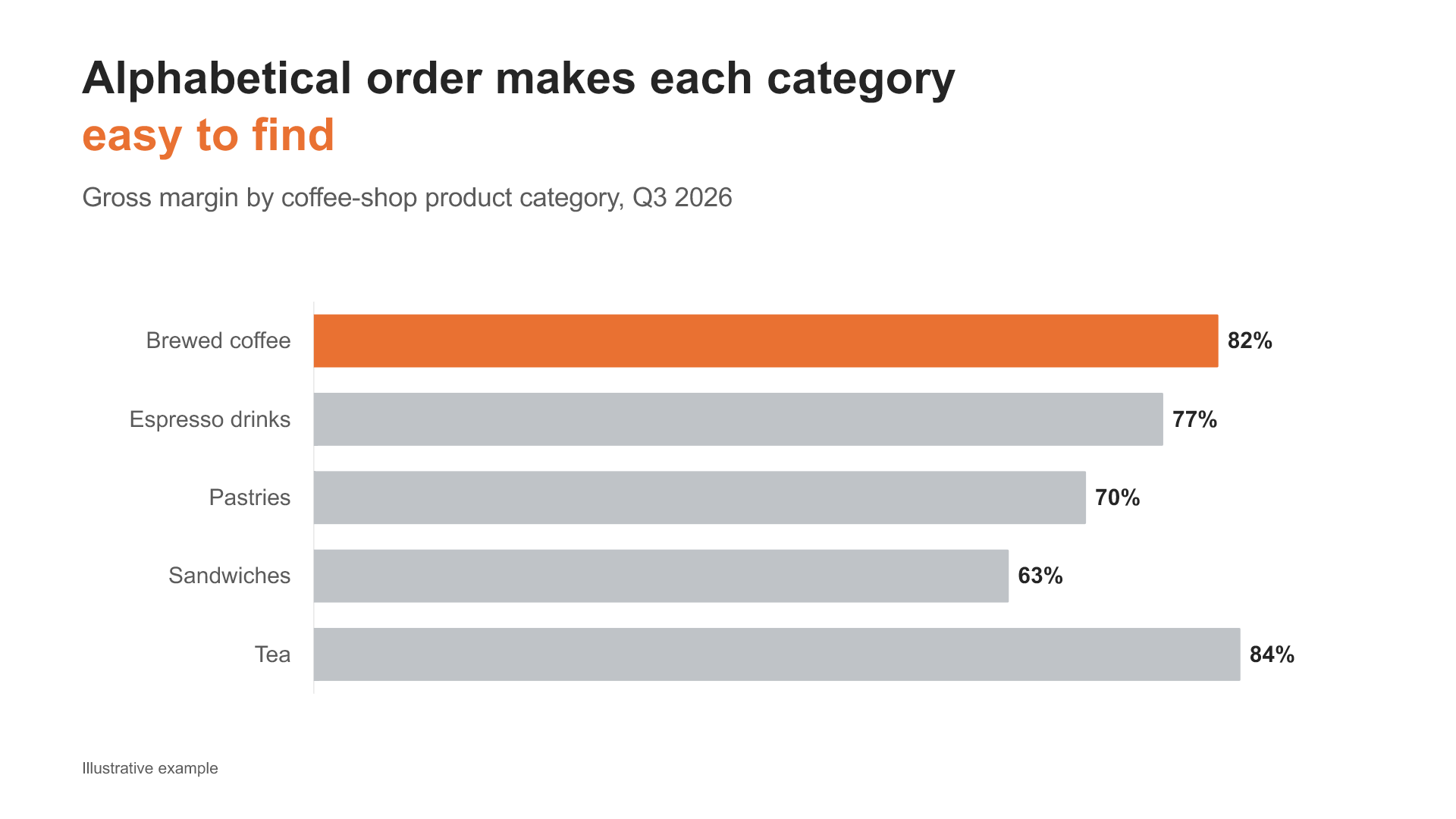
That makes individual categories easy to find. If someone asks, “Where is brewed coffee?”, alphabetical order works perfectly well.
But it does not immediately show which category has the highest margin, which has the lowest, or which one is furthest behind its target.
So perhaps we should sort by gross margin, from highest to lowest:
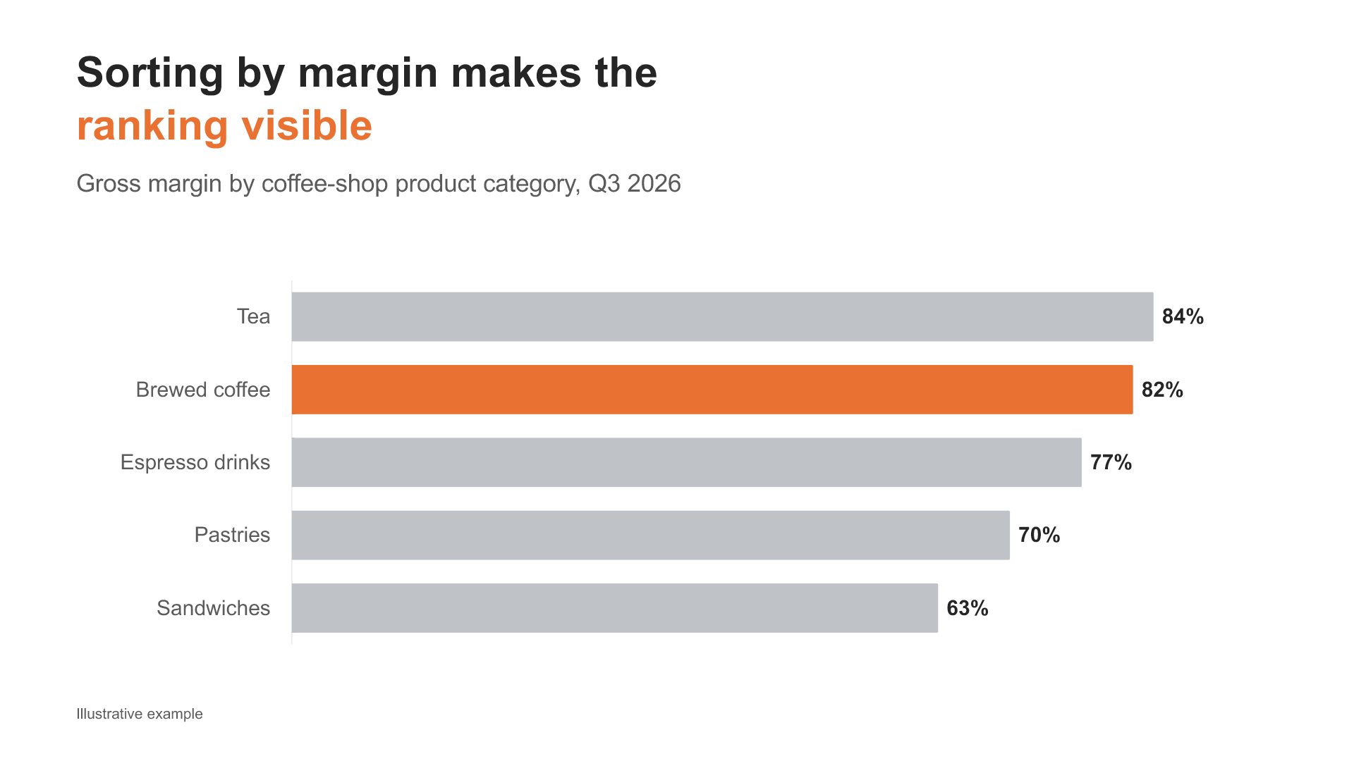
Now the chart answers a different question:
Which categories generate the highest margins?
Tea leads the portfolio. Sandwiches have the lowest margin.
But this is not necessarily the most useful view for a performance discussion.
Brewed coffee has the second-highest margin in the portfolio at 82%. It looks strong in the value ranking.
Against its own target, however, brewed coffee is four percentage points behind. That is the largest negative variance of all five categories.
If the management question is “Which categories are missing their targets?”, we should sort by variance instead, with the weakest result first:
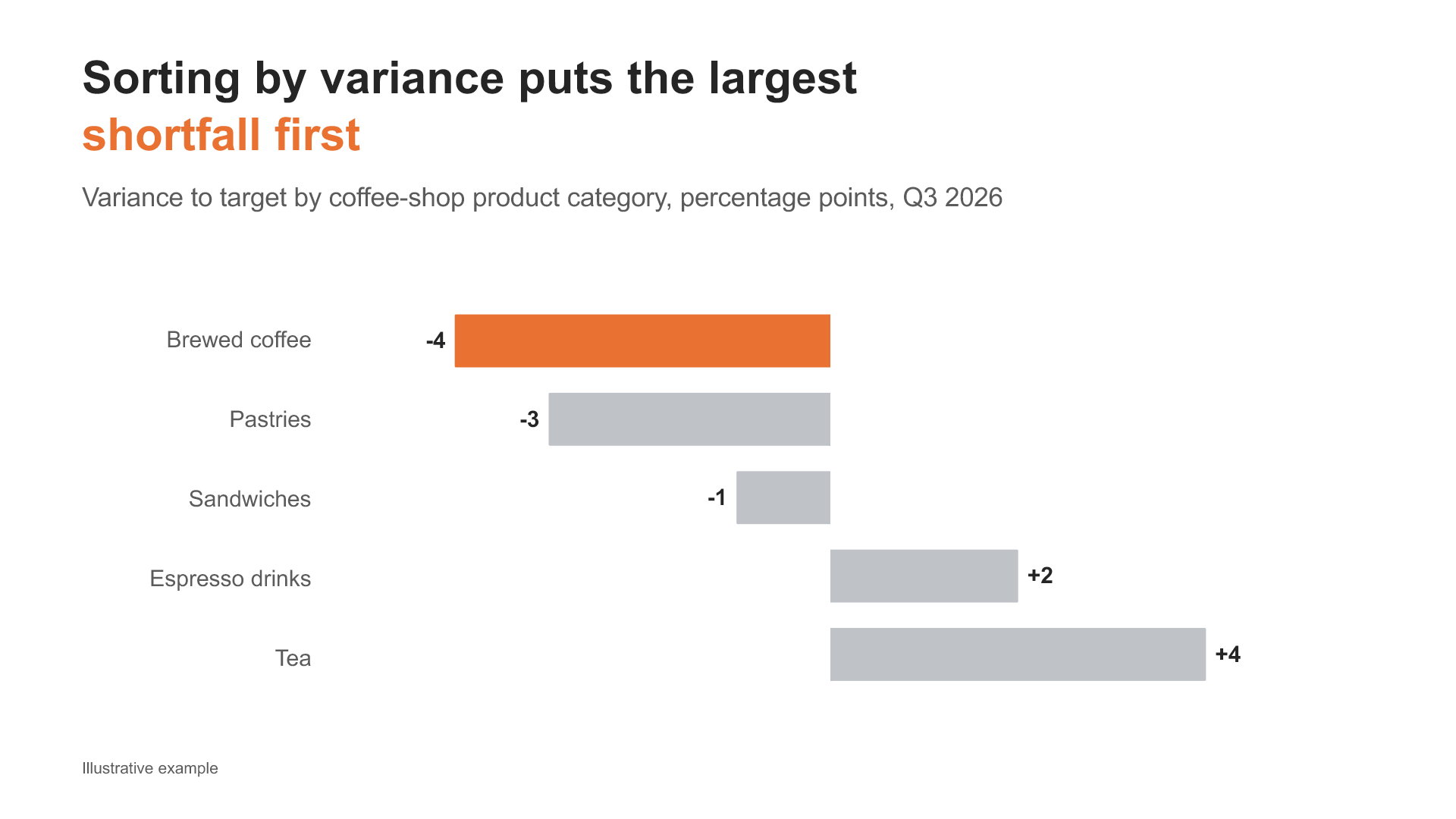
The same data now tells a different story.
Brewed coffee moves from near the top of the chart to the first position requiring attention.
Nothing about its performance has changed. We simply chose an order that matches a different question.
Sorting is part of the analysis
This is why sorting should not be treated as a mechanical formatting step at the end.
Before sorting, decide what the chart is for.
If the audience needs to find a specific category, alphabetical order may be best.
If the question is “Which categories have the highest margins?”, sort by the margin value.
If the question is “Which categories are furthest behind target?”, sort by variance.
The measure you choose for sorting shapes the story.
So does the direction.
Ascending or descending?
Descending order places the largest values first. It works well when the audience should notice the biggest products, customers, costs, or contributors.
Ascending order places the smallest values first. It is often more useful when low performance, shortfalls, delays, or risks require attention.
Neither direction is automatically correct.
Ask what belongs at the top of the chart.
- Should the reader see the strongest result first?
- The weakest?
- The largest deviation?
- The item they are most likely to look for?
That decision should determine the order.
When sorting does not help
Some categories already have a meaningful sequence.
Months belong in calendar order. Age bands belong in numerical order. Process stages, credit ratings, and survey scales usually follow their own logic.
Sorting those categories by value might make the ranking clearer while destroying the sequence that gives the data meaning.
Sorting should clarify the chart, not rearrange it blindly.
A practical challenge
Open one bar chart from your latest report.
Before changing the order, write down the question the chart should answer.
Then make three decisions:
- What should determine the order?
- Should that order be ascending or descending?
- What should the reader see first?
Sorting is not basic chart cleanup.
It is a decision about how the audience should read the data.