

When we compare monthly sales against last year and budget, the default choice is often a clustered column chart. At least, that is what I most often see in client dashboards.
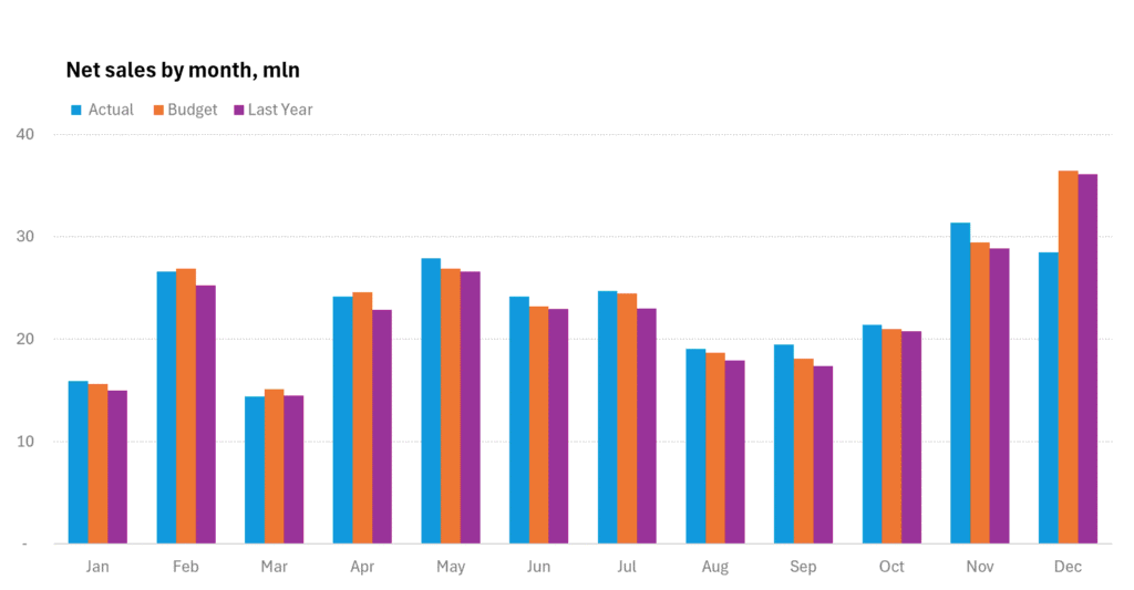
It feels familiar: actual sales, last year, and budget side by side for every month. And of course, the same problem appears with many other business metrics: current performance compared with a previous period and a target or benchmark.
But this familiar choice quickly becomes noisy.
With 12 months and 3 series, the audience has to read 36 columns. The chart shows the data, but it does not clearly answer the business questions:
Are we above or below budget?
Are we better or worse than last year?
Which months need attention?
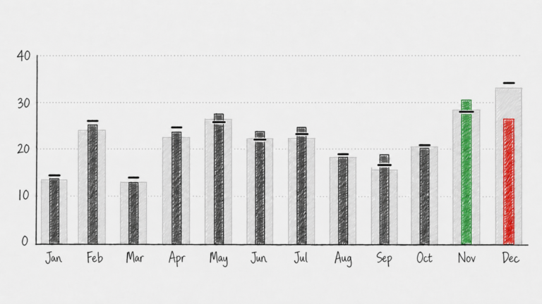
A vertical bullet graph answers these questions faster.
Instead of treating all values equally, it gives each one a clear role:
- Actual sales are the main column.
- Last year becomes a light background reference.
- Budget becomes a small target marker.
This visual hierarchy matches the business logic. Actual sales are the result. Last year is context. Budget is the target.
That is why the chart becomes easier to read.
For each month, the viewer can immediately see whether actual sales are above or below the budget marker, and whether they are higher or lower than last year. The comparison happens inside one compact visual unit, not across several neighboring bars.
This also makes exceptions easier to highlight.
In a classic clustered column chart, colors are usually used to distinguish between scenarios: actual, previous period, and target. In a bullet graph, those roles are already clear from the structure of the chart. That means color is freed up for a more strategic purpose: highlighting what matters.
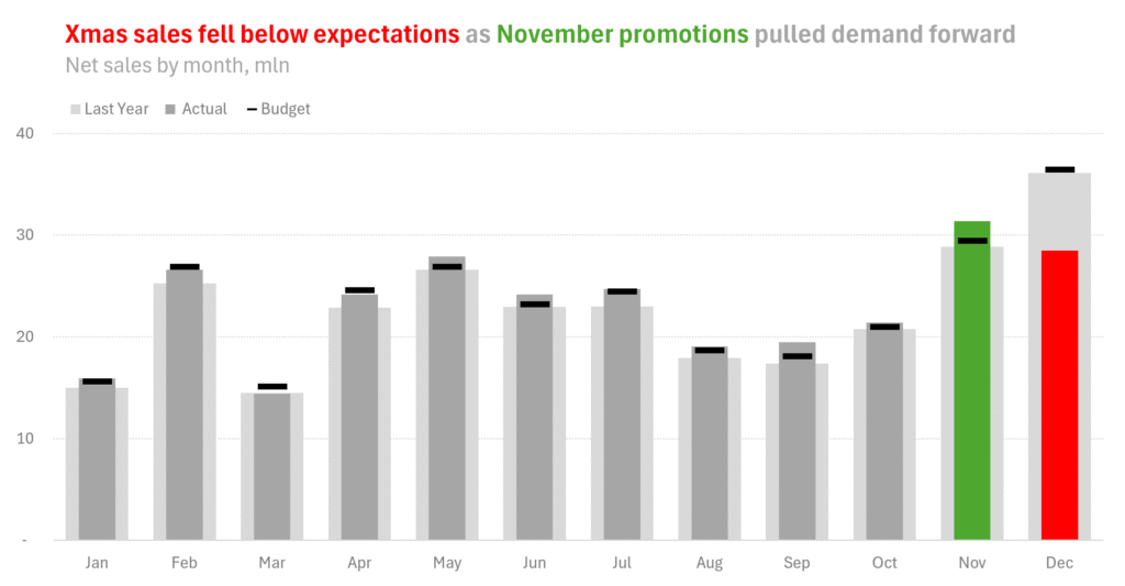
In the example, the story is not that every month is equally important. The story is that November promotions pulled demand forward, while Christmas sales fell below expectations.
A vertical bullet graph supports this message directly. November can be highlighted in green, December in red, and the remaining months can stay neutral. The audience sees the pattern before they start decoding the numbers.
Budget also works better as a marker than as a column. It is not a result; it is a target. Showing it as a small line communicates that much more clearly than showing it as another bar.
The same applies to last year. It is not the main story. It is historical context. A light background column gives it presence without letting it compete with the actual result.
This approach works in many other business scenarios too:
- revenue vs forecast and last year
- costs vs budget and prior period
- headcount vs plan and last quarter
- margin vs target and moving average
- inventory vs required stock level and last week
- customer satisfaction vs benchmark and previous survey results
Dashboards do not have the luxury of space.
Every visual has to earn its place. It needs to be compact enough to save screen real estate, but also accurate and intuitive enough to be understood quickly.
That is exactly where a vertical bullet graph works so well.
It combines the actual result, historical context, and target in one small visual unit. It reduces clutter, keeps comparisons precise, and makes the main message easier to see.
For this reason, the bullet graph is one of the charts I use most often in my dashboard toolkit. It is not just a cleaner alternative to clustered columns. It is often a better match for the way dashboards are actually read: quickly, repeatedly, and under pressure.
And if you don’t know how to create this chart in Excel, here is a step-by-step guide.